STUDENT WORK
REBRAND / AUDUBON DALLAS
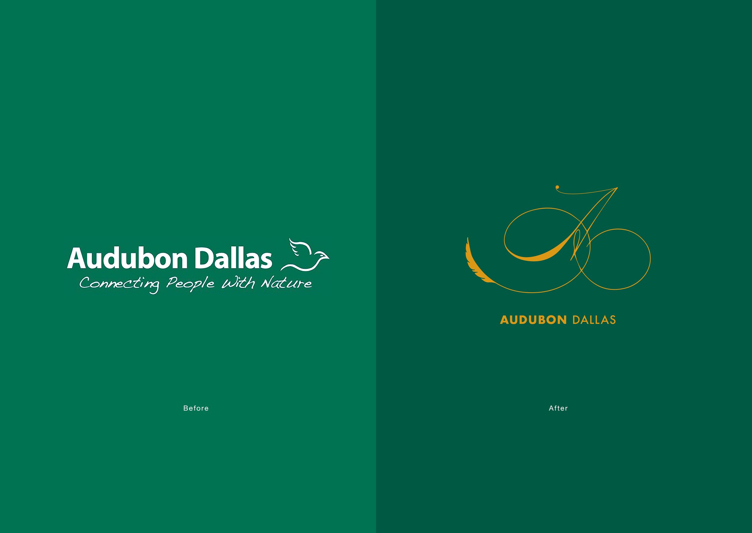
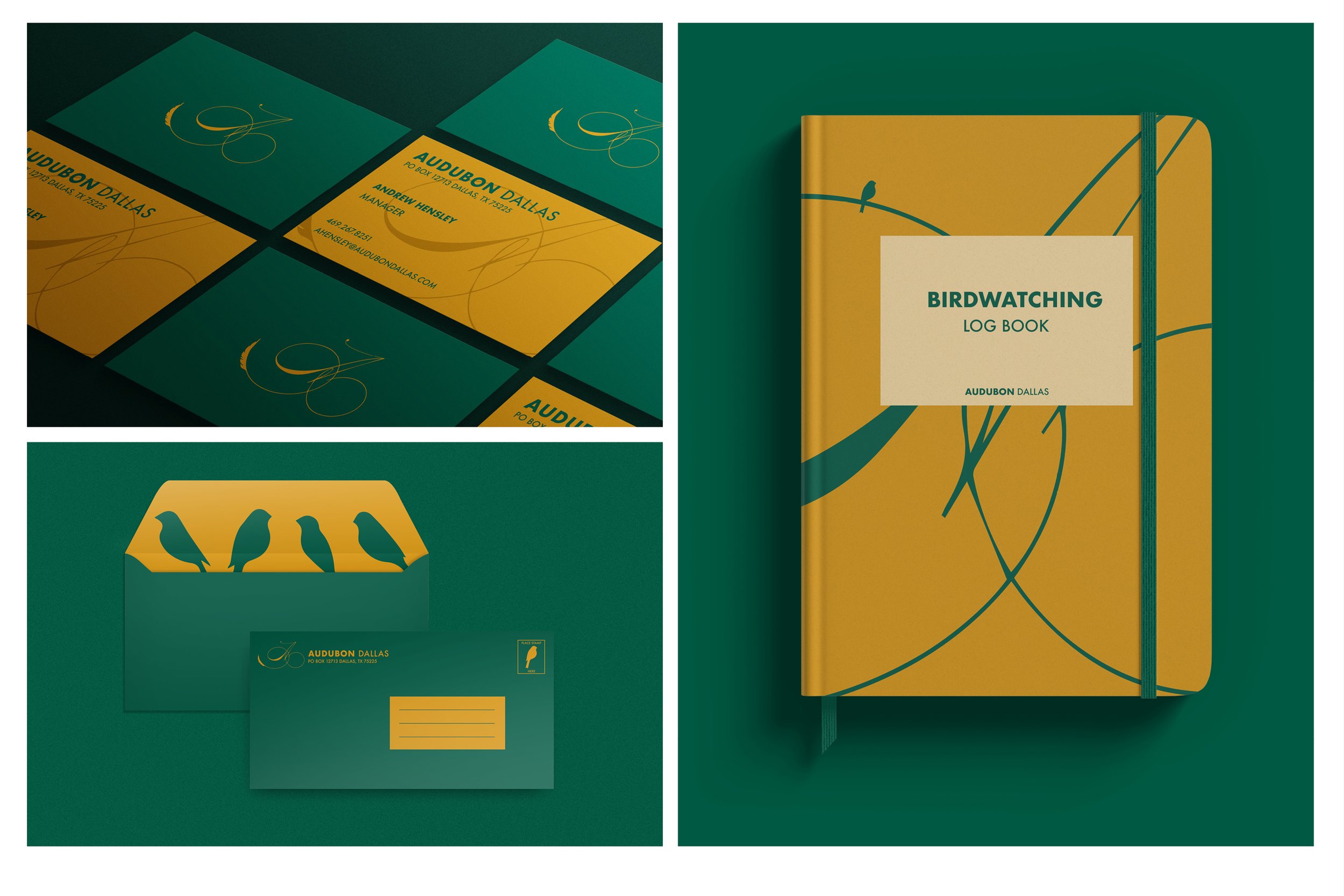
I chose to design a logo that reflects the fluidity of the birds Audubon Dallas protects. Additionally I wanted the organization to have a timeless brand that does not need to be revised/changed every few years. Green was chosen to reflect nature, while yellow embodies the sun piercing through the trees. The elevated taste of the branding was executed to give the organization a sense of class and legitimacy. All collateral was designed to have the same essence, but be different and unique in their own way.


OOH / AUDUBON DALLAS
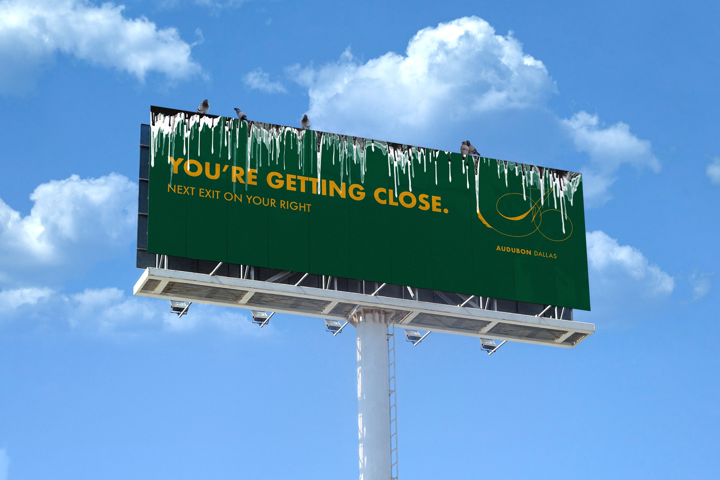
The billboard is intended to have bird seed located on the top of it. This will attract birds to it, and allow their poo to fall down the front of the sign. This juxtaposition of elegance and grotesqueness will capture the viewer’s attention and allow the sign to be memorable. It also plays on the fact that Audubon Dallas is a bird sanctuary. When you see the sign covered in bird poo, you know you're getting close.

TEAM
AD / CW / Designer Andrew Hensley
RECOGNITION
Dallas Addy’s Silver
